Olivia Hinton
Didot in Fashion Media
Formal Typography Analysis
The typeface selected for this formal analysis is Didot, specifically viewed in its iconic, long standing application as the masthead for Harper’s Bazaar magazine.
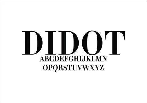
Didot is classified as a Modern serif typeface. Looking closely at the shapes, it looks very different from the older, rounded styles that were based on traditional handwriting. Its biggest design feature is that it does not have an even weight. Instead, it uses an intense contrast between the different parts of each letter. The vertical main lines are very thick and bold, while the horizontal lines and the small feet, called serifs, are incredibly thin. These serifs are completely flat and square, connecting to the main lines at straight ninety degree angles. On top of that, the round letters like the uppercase "O" are perfectly upright without any slant, giving the alphabet a very clean, geometric look.
Beyond just spelling out the title of Harper’s Bazaar magazine, the visual style of Didot carries a strong secondary meaning of luxury, high status, and expensive taste. The super thin lines resemble the delicate and detailed stitching found in high fashion clothing. Didot does not just show a basic emotion, it sends a very specific message of elite status. It immediately tells the audience that whatever they are looking at is high quality and exclusive.
For daily use, Didot is easy to recognize as separate words but very hard to read in a paragraph. At huge sizes like a magazine cover, it is perfectly clear because the large scale keeps the thin lines visible. However, in small text blocks, Didot becomes unreadable because the tiny horizontal lines disappear into the white background, causing a blinking effect that hurts your eyes.